
Your website is getting traffic; people are coming to your site, but aren’t becoming customers. The problem is not with what you are selling; the problem is with your website conversion strategy. Instantly boost leads by upgrading your website’s customer experience.
Why Most Websites Fail to Convert Visitors
Most businesses assume more traffic equals more leads. They’re wrong.
Want polished, research-backed blog content that keeps readers hooked? ➜ Tap here to hire professional writers and get started today.
A website that converts removes friction, builds trust, and brings the visitor toward one clear action. Without each of these elements, even high-traffic sites leave money on the table.
The good news? Small, strategic changes can dramatically improve your conversion rate overnight.
Fix #1: Make Sure to Clearly Explain Your Value Proposition Immediately
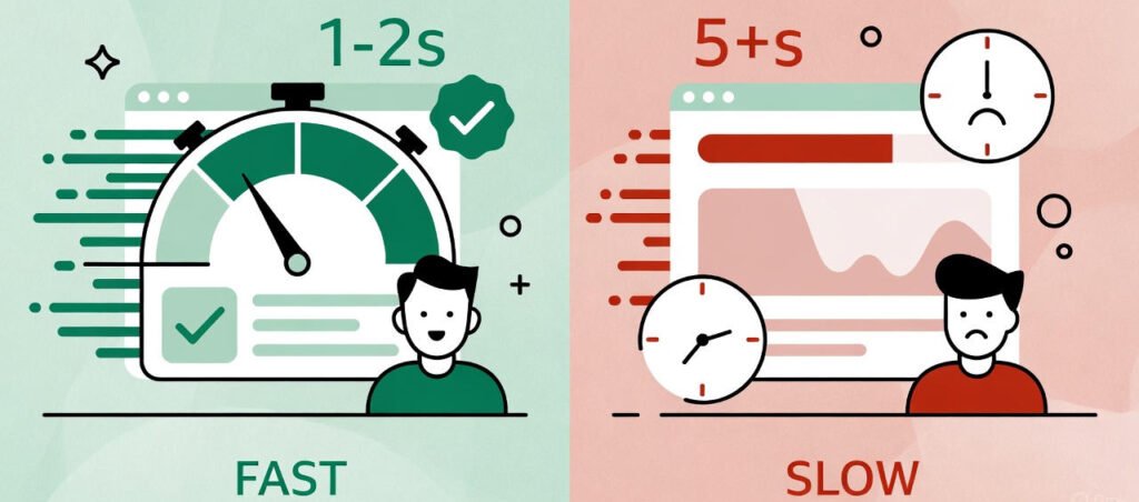
Visitors decide whether to stay or leave within 3 seconds. If, in that time, they cannot immediately understand what one offers and why it matters, they’re gone.

Your headline needs to instantly communicate three things: what you do, who it’s for, and why they should care.
Write Headlines That Convert
Headlines that read generic (“Welcome to Our Website, for instance) waste prime real estate. Use specificity: “Get 50% More Qualified Leads Through Strategic Content Marketing.”
Test your value proposition. Ask yourself: Could this headline apply to any of my competitors? If yes, sharpen it.
Place your best value proposition above the fold. Visitors shouldn’t have to scroll to understand the main point of your offering.
Fix #2: Avoid Unwarranted Navigation Options
Every link added to your navigation is a decision required to be made by your visitor. **More decisions mean more cognitive load, which kills conversions.
It means successful conversion-focused websites limit navigation to 5-7 items at most.
Simplify Your Menu Structure
Remove redundant pages such as “About Our Team” and “Our History” from primary navigation. These pages matter in terms of credibility but shouldn’t compete with conversion-focused pages.
Use descriptive navigation labels. “Solutions” is vague; “Marketing Packages” tells visitors exactly what they’ll find.
Consider making landing pages for a single offer completely navigation-free. Every point of exit lowers your conversion rate.
Fix #3: Make Your CTA Impossible to Miss
Your call-to-action button shouldn’t blend in. It should be asking for attention through contrasting colors that pop against your design palette.

An average website visitor sees only 28% of words on a page. Before your CTA can work its magic verbally, it must first stand out visually.
Writing CTAs That Drive Action
Ditch limp, passive CTAs using words like “Submit,” “Learn More,” or others, replacing them with active words: “Get My Free Audit,” “Start Converting Today,” or “Claim My Discount.”
Use several CTAs on long pages. Having to scroll back up to take action is not ideal for visitors.
Obsess over testing button size and placement. Small changes in the prominence of a CTA can double conversion rates.
Fix #4: Speed Up Your Page Load Time
Every second of load time costs you customers. Research shows 53% of mobile visitors abandon sites that take longer than 3 seconds to load.
Page speed impacts conversion rates, SEO rankings, and user experience all at once. It is one of the best-ROI website conversion tips you can apply.
Quick Wins for Faster Loading
Compress images without sacrificing quality. Large images, without optimization, are the #1 culprit behind slow websites.
Enable browser caching to ensure returning visitors will have your site load instantly. Lazy-load images below the fold.
Consider these proven speed improvements:
- Reduce HTTP requests by merging CSS and JavaScript files
- Employ a Content Delivery Network (CDN) to serve assets around the world faster.
- Uninstallation of unnecessary plugins and widgets, which bog down performance
Many business owners overlook speed optimization because it feels technical. But just like investing in your physical health through proper fitness routines, investing in your site’s technical health pays dividends over time.
Fix #5: Create Instant Trust With Social Proof
People don’t trust marketing claims; they trust other customers. Social proof turns skepticism into confidence.
Showcase your testimonials front and center on your homepage and key conversion pages. Use photos, full names, and specific results where possible.
Strategic Trust Signals That Convert
General praise such as “Great service!” doesn’t get results. Instead, show specific, measurable outcomes: “Increased our qualified leads by 127% in just 8 weeks.”
Client logos work much better when the visitor recognizes the brands. If you’ve worked with industry leaders, feature them prominently.
Display trust badges near points of conversion: security certifications, awards within an industry, “As Seen In” media mentions, and money-back guarantees all reduce perceived risk.
Consider adding real-time social proof notifications: “Sarah from Austin just downloaded the guide.” That creates urgency and gives good validation to your offer.
Fix #6: Optimize forms to reduce friction
Every field you add to the form drops conversion by a further 11% on average. Ask only for information you need right now.
Most B2B websites don’t need your visitor’s phone number, company size, and job title-just to download a guide. That information can come later.
Best Practices of Form
Use single-column layouts for forms. Multi-column forms create confusion for the eye and slow completion rates.
Replace dropdown menus w/ radio buttons if there are less than 5 options. Dropdowns take an additional click and obscure available choices.
Make the form labels clear. “Email” is vague—”Work Email Address” sets appropriate expectations.
Show progress indicators on multi-step forms. Visitors are more likely to complete the forms if they can see how much is left.
Auto-fill in and smart defaults reduce typing effort. The easier you make it, the higher your completion rate climbs.
Fix #7: Design Mobile-First experiences
More than 60% of web traffic comes from mobile devices, but still so many sites regard mobile as something secondary. Your mobile experience is your primary experience.
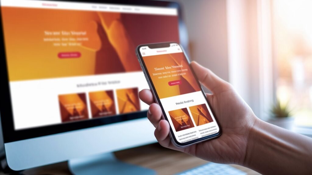
Mobile users exhibit different behaviors, contexts, and constraints than desktop users. What works on the desktop often fails spectacularly on mobile.
Mobile Conversion Essentials
Make buttons large enough to comfortably tap on – minimum 44×44 pixels. Frustrated mobile users bounce immediately.
Make navigation easier on touch interfaces. Hamburger menus work better than trying to cram desktop navigation into mobile screens.
Kill the pop-ups on mobile. They’re already annoying on desktop, and on mobile, they’re conversion killers.
Obsess over testing checkout on mobile. Look for any step that requires pinching, zooming, or an excess of typing, and then kill it.
Just as the traveler rewards a frictionless booking experience, so your customers reward friction-free mobile interactions.
Fix #8: Write Copy That Converts, Not Impresses
Your website copy should sound like a knowledgeable friend explaining your offering over coffee—and not some corporate press release drowning in jargon.
Focus relentlessly on benefits, not features. Visitors don’t care about your “enterprise-grade cloud infrastructure”; they care about never losing data.
Principles of Copy for Better Conversions
Use “you” language throughout. For example, “You’ll increase leads” converts better than “Our system increases leads.”
Break text into blocks. An online reader will scan; they won’t read word-for-word.
Address objections directly in your copy. If prospects generally are concerned about the length of time to implement, address it head-on: “Most clients are fully operational within 48 hours.”
Create urgency, not manipulation. Limited-time offers work, but fake countdown timers damage trust forever.
Include specific numbers and data wherever possible. “Reduce costs” is vague; “Cut operational expenses by 34%” is a better option.
Fix #9: Employ Smart Exit-Intent Strategies
Not all people convert on the first visit. This is where the exit-intent technology identifies that someone is about to leave and presents one final offer.

These last-chance campaigns can recover 10-15% of abandoning visitors when executed thoughtfully.
Exit-Intent That Actually Works
Offer real value in return for contact information. Discounts, free tools, guides, or consultations all work better than generic newsletter sign-ups.
Keep the exit-intent pop-up simple and fast. Ironic as it may sound, a slow-loading exit-intent pop-up makes certain that the visitor definitely leaves.
Personalize your exit offer based on the page they are leaving. Who leaves your pricing page may need a different offer than who leaves a blog post.
A/B test everything: timing, offer, copy, design. Small tweaks of exit-intent campaigns can drive huge lifts in recovery rates.
Don’t fire exit-intent on mobile or tablets: The technology is less reliable and often creates poor user experiences.
Bringing It All Together
Website conversion optimization isn’t about massive redesigns or endless A/B tests. It’s about understanding visitor psychology and systematically removing the barriers to action.
Most businesses never apply these website conversion tips because they are too simple to make a difference. That’s precisely why they work so well on whomever actually does apply them.
Businesses that dominate their industry online are not necessarily spending more on traffic; they simply convert more of the traffic they already have.
Begin with the fixes that require the least technical effort: clarify your value proposition, strengthen your CTAs, and add strategic social proof. These changes you can do today, with an immediate effect on your bottom line.
Much like strategic approaches to real estate marketing differentiate properties in competitive markets, these conversion principles will set your business apart in increasingly crowded digital spaces.
Take the Next Step Toward Higher Conversions
Your website should be your hardest-working salesperson-closing deals while you sleep. But generic advice only gets you so far.
Press N’ Release Agency specializes in transforming underperforming websites into lead-generating machines through strategic content, optimized messaging, and conversion-focused design principles.
Whether you need conversion-optimized blog content, landing pages that actually convert, or a complete content strategy overhaul, we’ve helped dozens of businesses turn their websites into powerful business assets.
Ready to stop leaving leads on the table? Check out our content and conversion optimization packages at Press N’ Release Agency. Let’s build a website that works as hard as you do.